Filters
Filters let you adjust how an image looks before you work with it. Here's a rundown of the ones available and what each does.
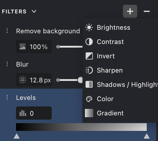
 Brightness — makes the whole image lighter or darker.
 Contrast — widens or narrows the gap between dark and light areas.
 Invert — flips the tones, so light turns dark and dark turns light.
 Levels — fine-tunes the tonal range across shadows, midtones, and highlights.
 Blur — softens the image and smooths out fine detail.
 Sharpen — crisps up edges and detail so the image reads as clearer.
 Shadows / Highlights — pulls back detail lost in the darkest and brightest spots.
 Remove Background — lifts the main subject away from its surroundings.
 Color — shifts the color intensity and overall look.
 Gradient — lays a smooth tonal or color transition across the image.
Brightness

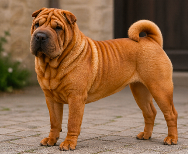
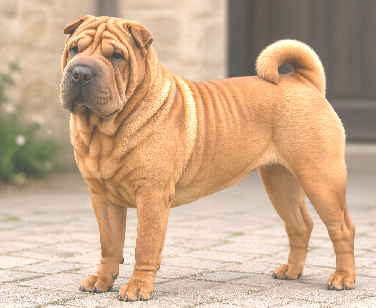
Brightness raises or lowers the light across the whole image at once. Reach for it when a shot comes in underexposed, too dark, or just hard to read.
Push brightness up to lighten the image and coax detail out of the shadows.
Pull it down to darken the image and rein in washed-out or overly bright areas.
| 0 | 25 |
|---|---|
 |
 |
 |
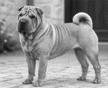 |
Contrast

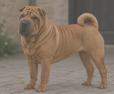
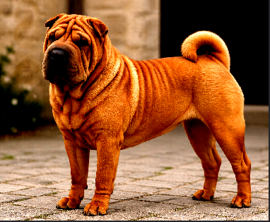
Contrast controls the gap between the darkest and brightest parts of the image — in other words, how punchy or how flat it looks.
Turn contrast up to deepen shadows and lift highlights, which adds clarity and impact.
Turn it down to close the gap between tones for a softer, flatter result.
| -50 | 50 |
|---|---|
 |
 |
 |
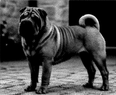 |
Invert

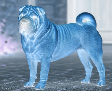
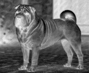
Invert flips every tone in the image: black turns to white, white turns to black, and everything in between swaps to its opposite.
It's handy for reading the tonal structure at a glance, trying out alternative looks, or working with light objects sitting on dark backgrounds. Inverting also makes white fills and bright details much easier to spot and edit.
| off | on |
|---|---|
|
 |
|
 |
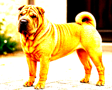
Levels
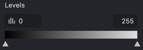
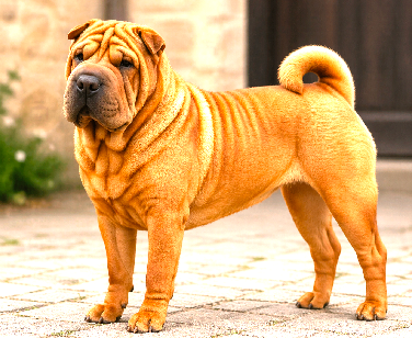
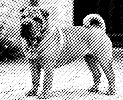
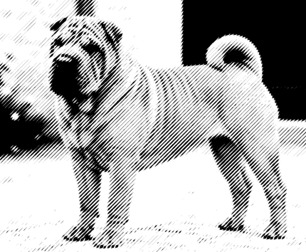
Levels reshapes the tonal range by giving you separate control over dark tones, midtones, and bright tones. The payoff is better balance, visibility, and contrast.
Use it to deepen shadows, brighten highlights, or even out the midtones. It really shines when an image looks flat, faded, or lacks clear separation between light and dark.
Levels is a natural first step for tonal correction before you move on to other filters — it gives you finer control than a plain brightness slider ever could.
| 0-150 | 40-100 |
|---|---|
 |
 |
 |
 |
Blur

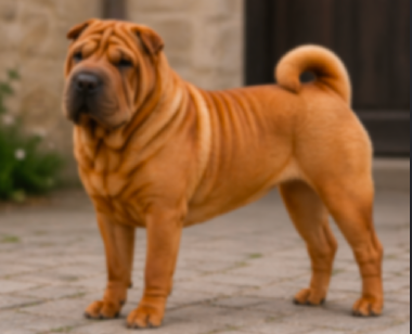
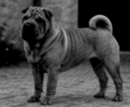
Blur softens the image by easing off edges and fine detail, leaving a smoother, less defined look.
It's good for knocking back noise, smoothing harsh transitions, or quieting a busy background so the subject stands out. It also works as an artistic touch or as prep for further processing.
A light blur just smooths things over; a heavy one wipes out detail fast — so go easy whenever sharp edges matter.
| 5 | 25 |
|---|---|
 |
 |
 |
 |
Sharpen
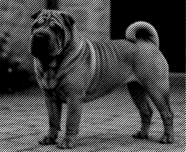
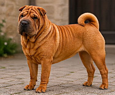
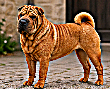
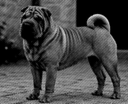
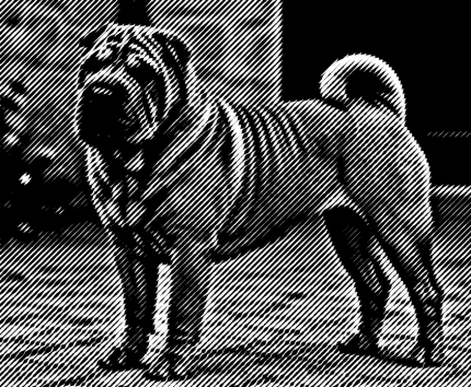
Sharpen boosts edges and local contrast so the image reads as crisper and more in focus, bringing out small details.
It's the fix for a shot that looks slightly soft or out of focus. The Amount setting controls how strong the sharpening is, while  Radius sets how wide an area around each edge it touches. A little goes a long way — overdoing it adds halos and noise.
| 50-10 | 250-20 |
|---|---|
 |
 |
 |
 |
Shadows / Highlights

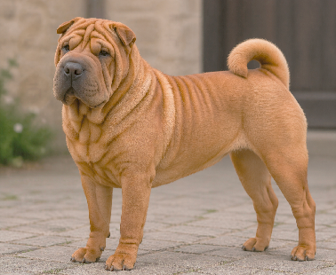
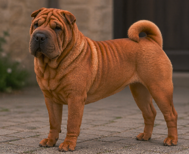
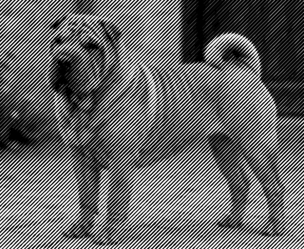
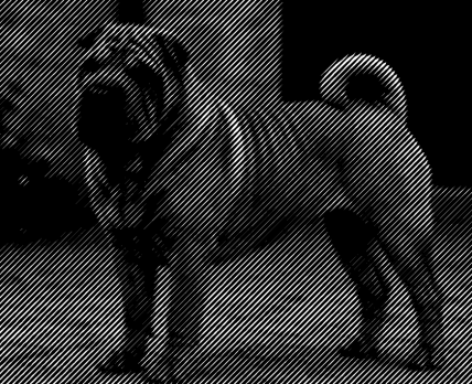
Shadows / Highlights treats the dark and bright regions of an image separately, so you can rescue detail buried in deep shadows or blown-out highlights without disturbing everything else.
 Lifting the shadows opens up the dark areas while leaving the rest of the image largely untouched.
 Pulling down the highlights brings detail back into overexposed, too-bright spots.
| 100-0 | 250-20 |
|---|---|
 |
 |
 |
 |
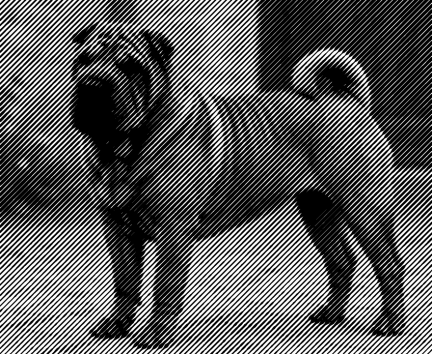
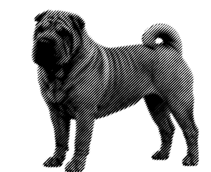
Remove Background
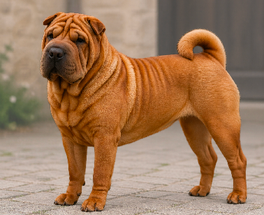
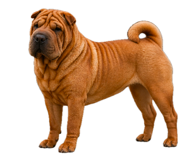
Remove Background isolates the main subject and strips away or fades out everything behind it, putting all the attention on the object that matters.
It's a go-to for product shots, cutting objects out, and any design work where the background just gets in the way. You'll get the cleanest result when the subject stands clearly apart from its surroundings.
| 25 | 100 |
|---|---|
 |
 |
 |
 |
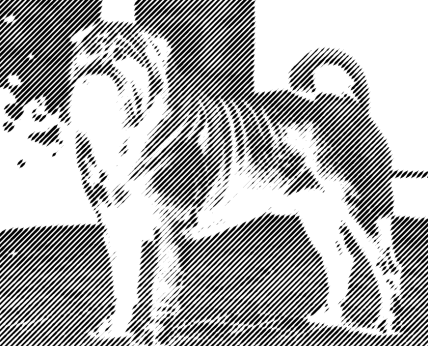
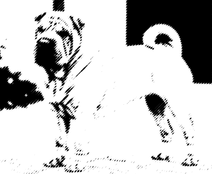
Color

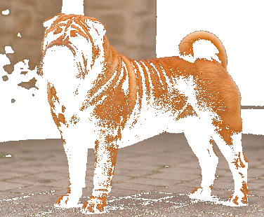
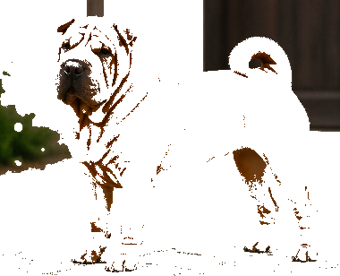
Color sets the target color the filter works from. Pick one from  the palette, or grab it straight from the image with
  the eyedropper.
 The Diameter setting decides how much of the image the eyedropper samples. A larger diameter averages across a wider area; a smaller one zeroes in on a single, precise spot.
 |
 |
|---|---|
 |
 |
 |
 |
Gradient
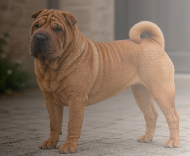
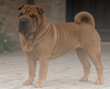
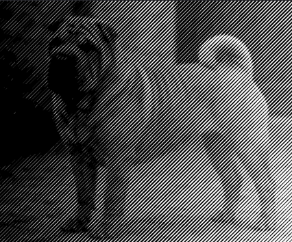
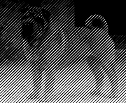
Gradient lays a smooth transition of tone or color across the image — great for adding depth, drawing the eye, or blending stylized shading.
Use it to brighten one side and darken the other, or to fade gradually between two tones or colors. The  value setting controls how strong the transition is and how firmly the gradient blends into the image.
 |
 |
|---|---|
 |
 |
 |
 |
Summary
Filters work on their own or stacked together to clean up an image, fix the tonal balance, bring out detail, or add a specific look.
A reliable order is to set the foundation with Brightness and Contrast, recover and refine detail with Shadows / Highlights and Sharpen, then finish with Color, Gradient, or Remove Background depending on where you want to land.